
Overview
The primary goal for the Support page redesign was to design a user experience that functioned quickly and efficiently for the majority of our users, so that they can come into the page, find exactly the firmware or documentation they need and then finally download it. The old Support page at that time suffered from a confusing, slow and inefficient user experience which did not serve well for a page that has more than 200,000 visitors per week.

Process
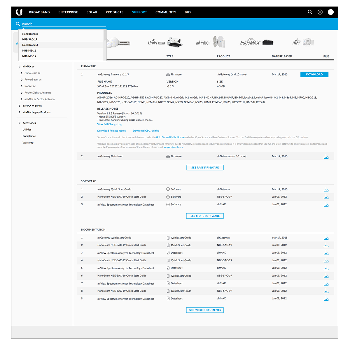
Clear communication across several different teams within the company was key in designing an efficient user experience. From our collected user feedback, we discovered efficiency as the key component in developing a better designed Support page for our users. We implemented quick points of user interaction such as auto-complete and auto-load search as well as a thorough product navigation tree which would display to our users only the most up-to-date firmwares and documentations available for download.
Research
We connected directly with our user base through use of Ubiquiti’s community forum in order to understand the pain points of the old support experience, and because of the loyalty of the users to the Ubiquiti brand, it was easy to gather valuable feedback. We achieved this by putting together a survey and asked carefully tailored questions in order to get the most honest and accurate feedback.
What we discovered was that because the old support experience assumed that the user knew exactly what they were looking for, which in most cases was not true. This was a major problem as it required the user to do a lot of manual searching and hunting of very specific files and documents, and thus a lot of time was wasted.

User Experience
The data we gathered from the community showed us that the biggest pain point in the support page’s user experience was how slow the journey felt in order to get to the support file they needed. Working closely with the product manager of the support and community experiences as well as the CEO, we collaborated on ideas for an improved user experience.
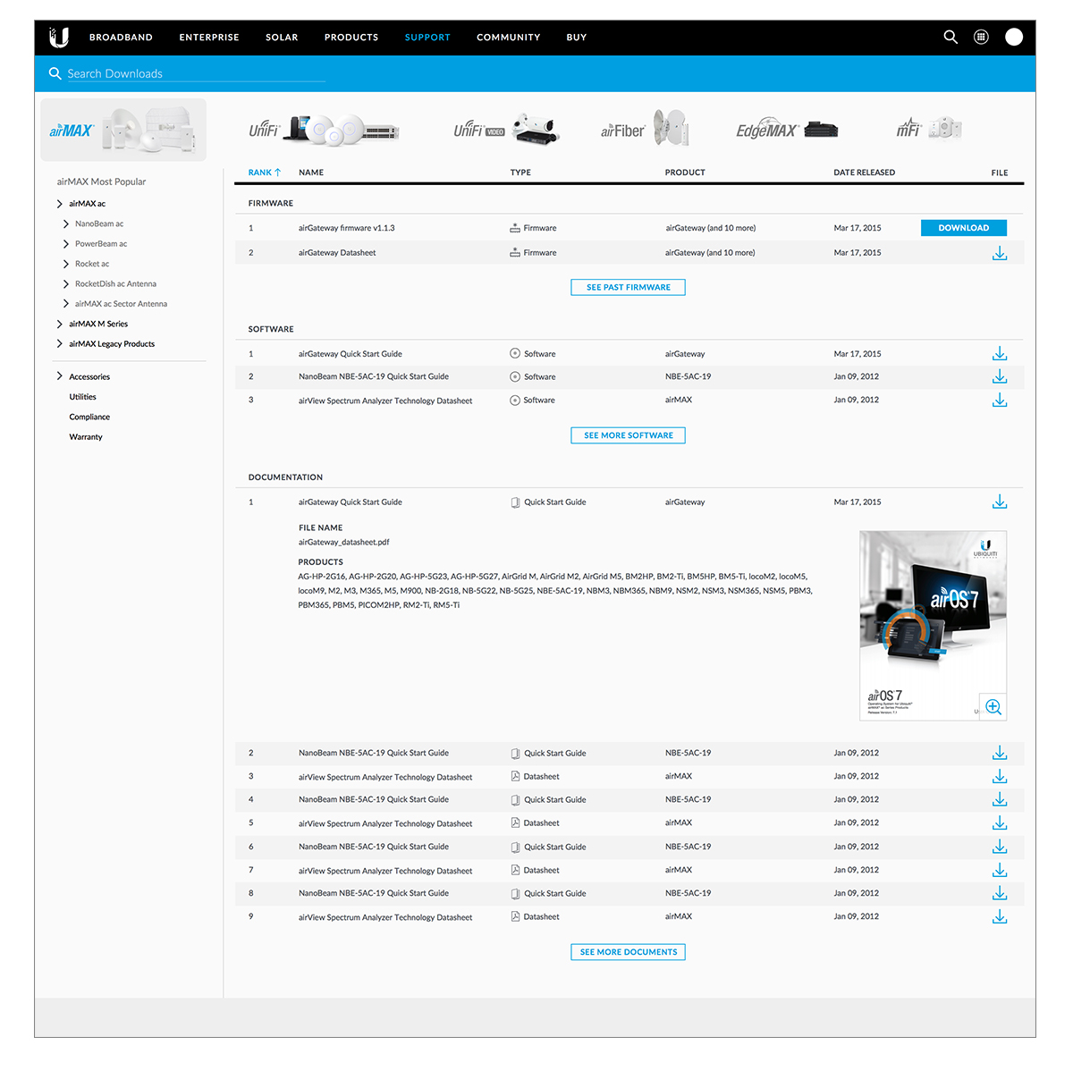
Our solution was to create an experience that immediately presented users with the different ways they can search and filter down to their desired support file. We did this by making a live search which quickly filtered the connect on the fly, as well as having the product families with their photographs as easily accessible filters, which also behaved as a quick search.


High-Fidelity UI
An important aspect of the the final UI was to make sure a good amount of data was shown as to maximize the ability to scan the page. We also made sure to surface only the most up to date support files as a business requirement to help keep the user’s products always up-to-date.
A clickable prototype was built in InVision and given to a subset of our users to test in which their responses were recorded. Overall, feedback was positive on the updated user experience with minor criticism.
Testing & Iteration
Upon initial release, A/B testing was conducted against the previous version of the support center to validate the new user experience. There was an 25% uptick in files being downloaded as well as less time being spent on the page, which told us the new experience was more efficient in helping users find exactly what they needed.